Monday, 28 January 2013

The final chapter of printing techniques!

So I am back to finish my little run through of the most common specialty printing methods. Today I'm going to take you through the printing styles of thermography and embossing.

Thermography

Thermography produces a raised and shiny type. This is done by first inking the paper with the design, this is then covered with a powder which adheres to the ink. It is then cured with heat and hey-presto you have a print that is raised off the page and beautifully shiny. I love the tactile feeling of this print, that means you can run your finger over the print, and the shine is fab-u-lous!. As I understand it, thermography, tends to only be printed single sided as the heat when applied to side 2 could damage side 1. The costs of thermography used to be relatively cheap, but as printers are stopping to do it, when you find a good thermographic printer their costs do tend to be higher.


Take a look at some beautiful examples below.


The last thermography example is designed by blush paperie

Embossing

Embossing is a dry print method; however, the difference to other dry print methods is that nothing is applied to the paper (so no ink, no foil and no colour). Embossing is a form of relief printing, in which two plates are used and the paper is pressed (with the addition of heat) between the two plates to produce a raised image. As there is no colour, embossing tends to be used for accents, rather than to print full invitations, as the details can be very difficult to read without colour.
It is a brilliant way to add that little extra detail to you invitations, without it being too over powering - take a look below and see what you think.


There are other varieties of printing, but the ones I have talked you through are the main ones you will tend to see being used. I hope this little guide has been helpful in giving you a basic understanding of what the different printing styles are and gives you some inspiration for what your wedding invitations could look like.
Have a happy Monday
L xx

Thursday, 24 January 2013

How to get the 'wow' factor with your wedding invitations - part two

In my post a couple of days ago, I took you through some of the options available for cardstock and some of the beautiful varieties you can get. As promised, I will now move onto taking you through the different printing methods available to you, so that you can choose a method that will complement your beautiful cardstock. I originally said I would do this all in one post, but having seen how long a post that would be - I think I may take a few blog posts to take you through it all.

Before I start, I just want to put in the disclaimer that I am not a printer, and do not profess to being one in any way. I have, however, been really lucky to work with some great printers who helped me to create my wedding invitations for my clients. But I have had to, over the last year, ask them all the silly questions about printing techniques so that I can create the finished product for my clients that them and I desire. So, this guide should hopefully put the answers to all those silly questions I have asked into a digestible form.
The printing methods that I will be covering are digital, letterpress and foil blocking.
Digital printing
This style of printing is printing that you will be very familiar with, as it is the style of printing that you will be used to at home at in the office. The main different is that it refers to printing undertaken on a large scale digital printer rather than your normal printer that you would have at home. Digital printing is the most common style of printing for invitations, primarily because it tends to work out cheaper - especially if you are having a smaller quantity of invitations. When printed on a large scale printer, the printing has a nice glossy finish to it, with no bleed to the ink, rather than the slightly duller and more bled finish that you would get if printing on a home printer.
Whilst digital printing can be good for lots of invitation types, and can still enable you to create an elegant and ornate invitation, there is an added finish and 'wow' that is created by speciality printing methods, of which I am going to talk you through two today; Letterpress and Foil Stamping 

Craig and Kate's wedding invitation - digitally printed Ayot and Gray Design

Letterpress
I am just going to put it out there – I reckon this has got to be my favourite specialty printing technique! This style of printing is absolutely stunning when it is done well. Letterpress printing was the everyday printing style for five centuries until more modern techniques took over. It is however, very on trend at the moment because of the intricacy of printing it allows and the fabulous overall finish you get with this printing type.
In letterpress printing, ink or tint is applied to a printing plate (which has a raised surface that includes all the print and design for the invitation – this is then pressed into card to make an ‘impression’, which provides the invitation with an indentation where the print has been pressed into the page.
Whilst this is more expensive that digital printing, letterpress works out more economical if you are having a larger volume of invitations printed, as the main costs involved are in creating the printing plate. As a result, this can work out very expensive if you are only having a few invitations printed.
Take a look at some beautiful examples below.


Invitations by Bella Figura
Foil Stamping
Foil stamping is a dry printing method, meaning that no actual ink is used. It works in a similar way to letterpress, in that a plate is made with the design and then a foil sheet is pressed between the plate and the card, and then heated up to keep the foil in place. For this style, in the past the foil has usually always been thought of as being shiny and metallic (usually gold or silver); however, foil comes in many colours and also in many finishes – from matte to super-glossy to clear. The prices for this are very similar to letterpress due to the similarities in the printing technique
Take a look at some examples below.
Black on Grey foil stamped invitation by  benign objects


Gold foil stamping by digby rose
So that's all I will take you through today. I hope you have enjoyed the nice eye candy and it has inspired you on some of the printing options available to you. Next time I will carry on my journey through the speciality printing types and will be talking about thermography and embossing
Back soon
L xx


Tuesday, 22 January 2013

How to get the 'wow' factor with your wedding invitations - part one

If you were to ask me why I have such a love for wedding stationery design, my hands down biggest reason would be that I love how you can create such an air of excitement about your wedding from the minute your invitation hits the doormat of your guest. When I am designing with my clients, I love planning with them as to how we are going to get that 'wow' moment!

It is quite hard though for brides and grooms to choose which style of enclosure they would like for their invitation, and which style of printing to opt for. So, in the next 2 blog posts, I am going to talk you through some examples of how you can use your cardstock and your printing technique to give your invitations that 'wow' factor.

Today's blog post, will be focussing on how you can do this with your cardstock and enclosures. There are several different ways that you can do this, and the choices wedding couples make can be based on the cost and the amount of information, and therefore inserts that want to send to their guests. Or it can be, for brides like me, a decision simply made when you find a design idea they fall in love with. Whatever the reasons though, hopefully this run through will help wedding couples see what the options are that are available to them

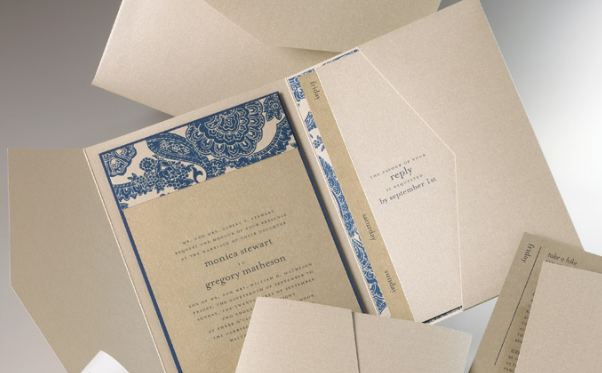
Pocketfold

I love a pocketfold design. This design involves having the main invitation attached to the centre of the pocketfold, with the inserts neatly displayed within the pocket for your guests, so everything from the maps and guest list information, to a stamp addressed RSVP is all there ready for the guests.  The pocketfold then folds up neatly, and can be held together by a paper band with the bride and grooms details on it, or by using a wax stamp to hold it together. These are just a couple of ways you can do it but the list can go on... The pocketfold when finished usually is inserted into a colour co-ordinated envelope and away you go. 

I have shown you a couple of examples below


Gate card

Another option that is similar to the pocketfold, is a gate card. The gate card does not have a pocket within it, but has the same style of finish. Perfect for wedding couples who do not require inserts, or want to provide RSVPs. If you do not want to include an RSVP, you can still do this with this design, and the photograph shows an elegant way of doing this through using a vellum wrap to hold the inserts together. 


Pocket envelope

I used a pocket envelope for my wedding, as I loved the finish that you could create with the envelope. The photograph below, is not from my wedding but shows what the inside of the envelope looks like. 


I included my invitation, a map and direction sheet, and an RSVP within the envelope. The design was finished with a metallic paper wrap style address label that were printed with the individual guest names on them, and mine and my husband's details on the back. The photograph below shows that I then held the envelope closed through using a silver wax stamp of a heart. I absolutely loved doing those wax stamps - it was such fun! The envelopes were inserted into clear envelopes and sent to the guests this way so as soon as they landed on their mats, they could see the details of the invitations. I was so excited when they were finished :-)


Portable pocket

Those of you who follow me on facebook will remember seeing Craig and Kate's invitations last year. They used a grey portable pocket, with a bespoke design tagged to create the perfect encasing for their vintage ticket style invitations. If you are opting for a more simple design, the portable pocket provides you with the perfectly understated way of ensuring that all your inserts stay in one place!


A portable pocket can be used in different ways, to the way I used it for Craig and Kate. Check out the stunning detailing in the photo below that has been used on a portable pocket, to display the bride and groom's names.


Another way that you can use a portable pocket, is to use one side of the pocket to attach your main card backed invitation, and then opt for an enclosure style pocket, that essentially has a cut down front that can display your inserts. So, when your guests turn your invitations over they will get such a brilliant surprise. Backing cards used within the pocket enclosure enable you to create a stunning backdrop for the inserts that you provide your guests with. 


Envelofold

The envelofold is a style of invitation that is perfectly suited to save the date cards, or invitations where you either do not want to send inserts, or you are happy for your inserts to remain separate to the invitation. The envelofold, folds down so that when your guest receives it, it looks from the outside like an envelope but when they open it they get a great, eyecatching surprise.


Z cards

Z cards are a lovely and contemporary way to tell a story within your invitation as they open up just like a story book. They provide you with plenty of space to use eyecatching graphics to really set the scene for the modern wedding. The example I have shown below is printed onto the white card backing of a patterned card. The font colours are matched to the patterned backing card so it cannot help but grab the attention of your guests. 


Simple invitation design

Those of you that follow me on facebook, and if you don't please check me out on my facebook page of ayotandgraydesign and click like, if you would like to stay up to date on the world of Ayot and Gray! Sorry, slight digression - those of you that follow me will remember Sophy and Tim's invitations that were a simple but elegant design to match their wedding. They used navy backing card to add an essential border to their invitations to give them a more polished finish. The choices of backing cards are huge, from beautiful metallic golds, to stunning bright colours or patterns to add something truly special to this style of design. 


You can print on vellums to provide an overlay to your invitation. Look how the example below helps make it very clear to us all that this wedding is going to be a stunning and elegant affair!


Or if you want to go for the simple design, but still keep all the inserts in one place - you can attach a matching pocket envelope to the back of your backing card to give your guests that wow factor when they turn the invitation over. 


Envelope liner


Last but not least, the envelope liner! Sophy and Tim used an ivory liner within their envelope as it fitted with their colour scheme, and it made their invitations look more finished. The choices of envelopes and liners is endless and you can use bolder colours and patterns to add more impact if that suits your style. I have shown you an example below of how you can add colour and patterns to really grab the attention of your guests. One of my wedding couples this year is using their envelope liner to create a stunning backdrop for their invitations and I cannot wait to show you when it is finished. 


I hope this has helped to give you a little bit of a guide on how you can use your design and cardstock to really get your guests talking. What I have discussed here is really only a flavour of what can be done, the options are pretty endless. 

Next time I will chat to you about the styles of printing you can use to make sure you don't let your fabulous cardstock down by going for the wrong printing technique :-)

Bye for now

L xx

Monday, 10 December 2012

Save the date invitations

I have had such good fun recently designing some save the date proofs for a bride, who has a great colour scheme of coral, grey and yellow. I love couples that go for a bright colour schemes, and this colour scheme was no exception. The coral and yellow really complemented each other and the grey providing the calming influence to make sure that the designs didn't veer towards being a bit too loud. I played it very safe at my own wedding, choosing ivory, blue and grey as my main colours, but I think if you choose your colours well, they can look really eye-catching and stunning.

For these designs, the bride sent me through some examples of the types of save the dates/ invites they liked and the type of fonts. It was clear from these that this couple favoured a design with a slight vintage feel to them and importantly the font needed to be the perfect combination of handwritten and italic.

When I am designing I always make sure that the proofs I design have a couple of designs that are at the extremes within the brief to see whether the bride chooses something different when they see it, as it's always good just to make sure that we are on the right lines with the design.

For the first two designs, I followed the brief pretty much to the letter and included vintage frame elements, handwritten style fonts and incorporated the three key colours.

Simple frame design

Coral circle frame design

The third design was a very modern style design, that did not have vintage elements apart from in the italic font chosen. This design was all about the striking italic date design that will instantly catch the eye and attention of the guests, and worked perfectly with the coral colour.

striking italic design


The final design, was a more elegant design in a 5'x5' square style, which included vintage style graphics as a border at the bottom of the invite,. The writing on this one was less handwritten and more of a modern italic style font. This design would look great printed using letterpress or thermographic printing. The letterpress, would press the coral regalia print into the card, whereas thermographic printing basically lifts the print off the page slightly so if you ran your fingers across it you would be able to feel the print. Thermographic printing creates a stunning glossy style of printing, that it's hard to replicate with other types of printing. Both types of printing come at a premium though which is why a lot of wedding couples opt for digital printing as it is more affordable.

Coral regalia border design


Would love to hear which design is your favourite, so please let me know


Back soon
L xx

Tuesday, 4 December 2012

I am on the hunt for an old, distressed looking wooden ladder!!


Let me explain why....

About a year ago, Adrian and I redecorated our irritatingly shaped and pretty small box room so it went from a plain magnolia space that looked like this (sorry for the poor photo)


 and ended up looking like this...
 
 
Adrian and I (more of him and less of me!) made the bed and the bookcase from scratch so we’re pretty proud of ourselves J.

I’ll digress slightly for a minute just to tell you a bit more about this bed. When we first moved into this house we set a desk up in the room, and then piled all our boxes into the recess in the room but it was a really bad use of space and looked pretty dreadful if I’m honest. So last Christmas, as I lay in bed with a chest infection, I started to sketch out some ideas for what we could do – much to the delight of my husband who got greeted with these ideas every night when he arrived home from work! I ignored the ideas that our house builder had for this room, which was in one word ‘horrific!’


 Anyway during these searching sessions, I found this day bed on pottery barn and thought it would look great in our room and would provide us with an additional small bed for when my friend’s come to stay with their children and when my little niece is old enough to come and stay.
 
 
However we couldn’t afford the money for the bed as it was a whopping $899 plus shipping and import tax!! I then found this amazing site call ana white (click HERE to go to her site) that shows you how to make specific bits of wooden furniture from scratch.

So off Mr W and I went to the timber yard up the road and hey presto, a little bit of drilling, swearing and painting later – we had a base for the bed!!! I think it cost us about £60 to make the base for the bed!


Add a mattress, some baskets and some bedding and cushions later and we had our bed!!
 

Inspired by making this bed we then moved onto making a bookcase that would fit the alcove within this room. Mr W turned into my very own handy Andy over the couple of weekends where we were doing this :-) The bookcase looks a bit of a jumble at the moment, but at least the picture gives you a feel for how the room looks.


Ever since we completed this woodwork class, I have been looking for 2 things to finish off the room:
  1.  A wooden small, distressed looking step so that little people that use this bed when they come to stay can get in it.
  2.  
  3. An old looking ladder that can form a magazine rack so we can sit on this bed and catch up on some reading.

Here is my inspiration for the ladder...


 And for the step....


This blog post will frustrate my dad no end as he can’t understand why I would want to fill my house with old things! But I think they will look brilliant in this room and really finish the room off. So far though I have drawn a blank, so keep your eyes peeled people as I am becoming desperate…

Once I find these I need to move onto finding a small table and a lamp.  I love this side table from cox and cox – nudge nudge wink wink Mr W!!!
 
 
If anyone finds me that ladder, I will quite literally love them forever!

Be back soon

L xx

Wednesday, 28 November 2012

Our own wedding decor

For our wedding in 2011, it was my first foray into the world of event design and invitations. The first thing we booked after we had got engaged, was our reception venue. For as long as I can remember I have been on walks through the grounds of Brocket Hall in Hertfordshire with my family and had always dreamt of what it would feel like to be lucky enough to get married at Brocket Hall, and to have your photo taken on the bridge looking back at the golf club and Brocket Hall. So when my parents said that we could have our reception there, I was completely thrilled. The golf club venue provides an absolutely stunning backdrop of a wonderful golf course.


I love all things vintage inspired, and desperately wanted to incorporate this theme into our wedding, especially as I had found a wedding dress with vintage style lace detailing. The venue did not lend itself perfectly to vintage style decor as it was a very light and pretty modern building, but where there is a will there is a way!

For my flowers, I was 100% inspired by Finch and Thistle Design. Rachel, who owns Finch and Thistle was in my form at school until her parents moved to America and I have watched her career and amazing skills with all things floral and decor from a far through the wonders of facebook for the last few years. I printed off pictures of bouquets that Rachel had designed for her brides and gave them to my florist so that I could try and explain what I liked as I have absolutely no idea what any flower is called - apart from maybe a rose and a peony!! The ladies that did my flowers were fab and they created the following bouquets for me and my bridesmaids. Thank you Rachel for your fab inspiration and for all the advice from a far!


At the reception venue we were going to tie in my husband's love of classic books into the decor, so we started this association through using books for the ring bearer to carry the rings on rather than a cushion. William, our page boy, did an amazing job helped by a bit of bribery from the best man (who was helped by William's mum!).


At our reception venue, we use the marquee part of the venue that formed the drinks reception area to set up some of our vintage pieces, which included a vintage typewriter for the guest book, an old suitcases that were used for our table plan and card box, and a photo booth. I found some small, blue, apothecary bottles on etsy and was thrilled that my florist used them!


The photo booth, and the best men, that carried the frames and camera around with them as the night went on, created some of the best photographs of the whole day. I love the one above of 3 of my closest friends!

Having spent many a wedding hobbling around once my feet start to ache from my uncomfortable shoes, although that's not as frequent nowadays that I'm married to a shorter husband (!) I also provided the ladies with flip flops for their tired feet!


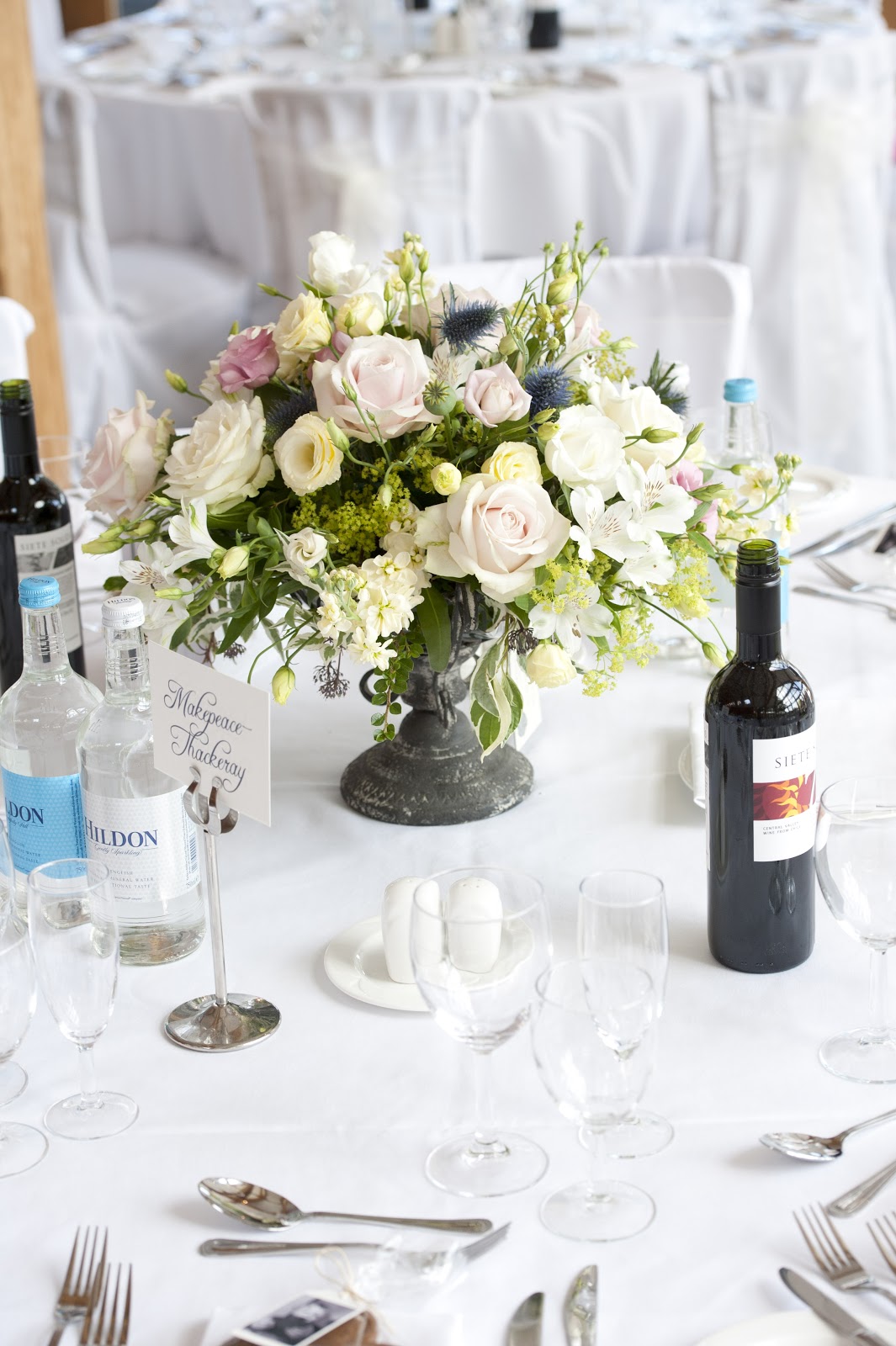
For the tables in the marquee we had centrepieces of flowers in urns. You would not believe how far and wide my mum and I searched to find these urns but I'm so glad we found them as they really helped with the vintage vibe.


For the centrepieces on the tables in the main reception area, we really wanted to incorporate my husbands love of old classic books, along with use rustic centrepieces, so we alternated the centrepieces amongst the tables. My lovely friend Helen, who is an extremely talented baker, made my wedding cake for me and made these fabulous table name gingerbreads, which we tied with a tag that had a message from my godson, William.


Helen matched the lace detail of my dress to the detailing that she created on the cake - very clever and it looked and tasted great!!


Hope that gives you a flavour of the decor that we used for our special day. It would be remiss of me to write this blog article without thanking my friends that turned up in the pouring rain, the night before the wedding, to help us set up at 11pm! That really is beyond the call of duty and we were very grateful for their help.

I will leave you with two final photos - after 29 years of waiting - I got my photo on the bridge :-)

Back soon

L x


Wedding photographs courtesy of Spencer at Repartage